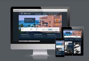

Sheraton.com gets new look as part of brand update

Sheraton Hotels & resorts has overhauled its website to match the brand’s new visual identity.
The new website roll out is the first phase of a larger brand repositioning, and features a modern colour palette, enhanced user experience, and high end design and photography.
The redesign is one of several initiatives underway for Sheraton 2020, a 10-point plan to reposition Sheraton.
The initiative includes a US $100 million marketing campaign and the launch of its new premier tier, Sheraton Grand, continuous innovation of the Sheraton guest experience and a goal of opening more than 150 new Sheraton hotels by 2020.
Sheraton.com features a refined brand logo, new fonts, and bold backgrounds to underscore the luxury of the Sheraton brand.
Additional benefits of the Sheraton.com redesign include an easier booking process with improved Find Reservation technology, user-friendly updated maps, and accessible search menus throughout the site.
Starwood Hotels & Resorts Worldwide interim CEO Adam Aron commented: “More than ever, a compelling and enriched digital presence is necessary to win the hearts and minds of consumers around the world.
“With millions of visitors annually, we naturally turned to Sheraton.com to first showcase the new visual identity for Sheraton as we continue to put the spotlight back on Starwood’s largest and most global brand.”
Sheraton Hotels & Resorts global brand leader Dave Marr said: “Sheraton offers guests a high-end, contemporary experience at our hotels around the world, and it is important that our brand aesthetic have the same modern, sophisticated look and feel.
“As we begin to roll out the new identity for Sheraton, we have first launched a redesigned website that features fresh, editorial-inspired content, more intuitive booking and search methods, and enhanced back-end technology to better engage consumers and drive revenue to our hotels globally.”