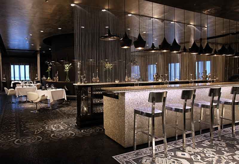
11) PEARLS & CAVIAR, SHANGRI-LA HOTEL QARYAT AL BERI
The dual-concept of Pearls & Caviar was devised by Netherlands-based company Concrete.
”The concept for the restaurant and bar derives from the pearl diving and fishing heritage of the UAE,” explains Shangri-La Qaryat Al Beri director of sales and marketing Natalie Glorney.
“The outlet actually features a classical poem in Arabic about pearl diving, wrapped around the exterior of the building.”
According to Glorney, an F&B outlet’s interior design defines “the mood, style and tone of the whole outlet experience, including the food”.
“It immediately gives out an impression to a guest walking in,” she notes. “So they will expect the food to be contemporary if the surroundings are.
“In Pearls & Caviar, the striking use of colour, with black downstairs in Caviar restaurant and white upstairs in Pearls Bar, naturally divides the two areas.
It’s important to remember that whatever the concept behind an outlet, this should resonate in every piece of furniture, every decoration and every material used, continues Glorney.
“No matter how trendy, classical or quirky the restaurant, to be successful it must still be comfortable and a place that people would want to relax and be seen in,” she says.

| Advertisement |
Keep your eyes peeled for the Top 10 Outlet Interiors, coming to HME.com later this week.
In the mean time, let us know your opinions: who would you like to see in the final list — and who does not deserve to be there?
Click on 'Comment' halfway up this page to make your voice heard!


 Search our database of more than 2,700 industry companies


Sep 23, 2009 , United Arab Emirates
good if the price is righta